

The ultimate guide to AI for small businesses
AI is no longer just for big companies. This thorough guide explains what AI does, what it costs, and where Canadian small businesses can start today.
 Calculating time...
Imagine this: a potential customer is scrolling through their phone while waiting for their coffee. They stumble upon your website, but instead of finding a smooth, fast, and user-friendly experience, they’re hit with tiny, illegible text, buttons they cannot click, and images that refuse to load. What happens next? They bounce. And just like that, a sale slips through your fingers before your site even gets a chance to show off your products.
According to Statista1, mobile devices accounted for over 60 per cent of global website traffic in 2024. If you were looking for a sign to have a mobile-friendly website, let this be it.
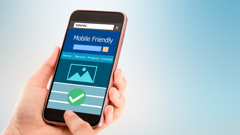
A mobile-friendly website is no longer a bonus feature- it's essential. What does this mean for your business? It means your customers are not sitting at a desk with a laptop when they are looking up your business for the first time. They are standing in a queue to buy a croissant. Lying on the couch browsing tv series or riding transit travelling to work. And they expect the same seamless experience they would get on a desktop or laptop.
A mobile-friendly site is one that:
Loads quickly (check your website loading time on https://www.browserstack.com/speedlab)
Has text that is easy to read without zooming in
Features buttons that are spaced for fingers, not mouse clicks
Adjusts to any screen size
Feels effortless to scroll and navigate
Mobile-friendliness is not just about aesthetics or convenience. It affects your business in real, measurable ways.
Trust: A study found that 88 per cent of users are less likely to come back if the website is not mobile-friendly2.
Sales: Mobile users who have a negative experience are 62 per cent less likely to make a future purchase3.
Search visibility: Google uses mobile-friendliness as a ranking factor, which means if your site is not mobile-optimized, it is less likely to show up in search results4.
A bad mobile experience could mean losing your customer’s trust, their business, and your visibility online. That is a triple hit no small business wants to take.
You do not need to be a developer to start making your website mobile-friendly. Here are a few ways to improve your site today:
Use responsive design
Choose a website theme or template that automatically adjusts to different screen sizes. Platforms like Moneris Online offer responsive themes out of the box.
Optimize your images
Compress large images to make sure they load fast on mobile. Tools like TinyPNG or ImageOptim can help without sacrificing quality.
Make text readable
Avoid small fonts. Stick to a minimum of 16px and ensure there’s enough contrast between text and background.
Test buttons and navigation
Make sure buttons are easy to tap with a thumb and spaced out enough, so users do not accidentally hit the wrong one. Stick to clean and intuitive menus.
Speed it up
Use tools like Google PageSpeed Insights to find out what is slowing your site down and get suggestions on how to fix it.
Run a mobile-friendly test
A free mobile-friendly test tool is a great place to start. It tells you how your site performs on mobile and what needs attention.
Think of your mobile site as your digital storefront window. Is it clean? Inviting? Easy to walk through? Does it make people want to come in, take a look around, and stay for a while?
When you prioritize mobile-friendliness, you are not just upgrading a website. You are enhancing your customer experience. It shows that you respect your customers’ time, value their experience, and are ready to serve them no matter how they reach you. You are making your business easier to find, easier to trust, and easier to shop at.
And in a world where people carry the internet in their pockets, that small step makes a very big impact. If you want your business to grow online, a mobile-friendly website is where you begin.
_________________________________________________________________________________

AI is no longer just for big companies. This thorough guide explains what AI does, what it costs, and where Canadian small businesses can start today.

Let’s explore why blogging is important for your business.

Prepare your restaurant patio for summer 2026 with practical ideas to increase seating, improve service, and attract more diners during peak season.

Get practical insight into Moving Day, why it matters in Quebec and which payment setup fits short-term sales.